Saturday, August 29, 2009

boris tellegen


delicious. boris tellegen aka delta is a trained industrial designer from amsterdam, doing these amazing things...


from the diversion series:


vhdg:
yum. yum. yum.


delta's lettering is pretty well known, due to its abstracted and isometric drawing feel. this is what i had in mind for the JOIN logo back in the day.

Thursday, August 27, 2009

daniel arsham

untitled (project for dior)


hammock


building cavity (wall)

wow. i want. these sculptural pieces from daniel arsham are stunning!

via swissmiss.


Tuesday, August 25, 2009

andrea posada

segundo tramo de la transición


viene un pensamiento

viene un pensamiento detail

Señorita 22


esa soy yo hecha lluvia


loving these illustrations from colombian artist, andrea posada.

i'm also loving the fact that beth is my neighbor and lives in my complex.

whoop.

Saturday, August 22, 2009

a+ for a+


oh the beloved javits...heh...

spending that much time on the far west side almost makes me hate new york. the words hate and new york have never appeared in the same sentence out of my mouth.


i loved the armature they provided for us to display our lights from. the booth was designed by the american design club.


"you are a lovely human"
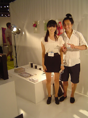

ok, mihoko and sherwood of the. just might be *THE* cutest design duo around. (dylan and jean are serious contenders, too though.) i especially like their anti-theft lunch bags and speak-ers. you can see more of sherwood's work here.

colin o'dowd has a new napkin, graphkin, that i was super into. gives you some guidelines for those drunken sketch sessions at bars. more of his products here.

colin o'dowd's beat coat rack.


pete white's 'le petit dej' was a real hit in our booth. my photography blows, but this breakfast tray does not.

design to go pop-up

the "design to go" pop-up at the port authority (at 41st and 8th ave in manhattan) organized by areaware and the american design club was a success. there was a lot of product and not all was labeled (so i apologize for any lack of info), but it was a good show and a super fun party.

it's hard to see it, but the fluorescent lights read 'DESIGN TO GO" as does the string installation. (click image for larger)


kim checking out our 'destination cities' key chains. laser cut and etched key chains of the 10 most dangerous and 10 safest cities. we've already sold some!

left: canvas bags - designer unknown / right: tyvek bags by our friends at grain

necklaces by grain


left: misc / right: some great stamps "i swear on my mother's grave i'll never do that again" designer unknown (for areaware)

left: russian doll table from rich, brilliant, willing / right: the future perfect section

designers unknown

big kudos to kiel mead for all of his hard work!

Friday, August 21, 2009

miss miss

it's been, like, a week, and that's been, like, too long...


mies is trying to be elvis in the top most right...

Monday, August 17, 2009

rip dash snow


i made it to the last day of the dash snow memorial at deitch projects on saturday - and of course it was pretty heavy. i don't know exactly how i feel about his work, but he was undeniably controversial, unconventional and certainly tragic. video footage of the hamster nests was especially disturbing.

on a lighter note, i should have some images of our booth (which looks amazing) from the gift fair to share soon. we'd had great feedback with both the mini-pedestals and the frame lights, and we've met some interesting people, for sure. september is going to be a BUSY month. :)

Sunday, August 16, 2009

design-to-go update

the opening is on tuesday, not monday. (!!)

Friday, August 14, 2009

New York Int'l Gift Fair & "Design-To-Go"

i'm working remotely today from my lovely friend andrea's condo on the upper east side as i am in nyc for the new york international gift fair. we are very excited to have been selected to show with a+ the young designers’ platform at accent on design.

we will be showing the mini-pedestals SELECT and the frame lights (selected sizes now available with corian diffuser!!).

'the hand that made em' brian skillfully models the frame lights in magenta.


'framed corian light' what do you get when you combine TWO of i&m's products? amazing, that's what you get, you get amazing. hehe.


'you are a lovely human' is our new print piece. instead of doing a product tear sheet - you know the things that you pick up at trade shows that just end up in a drawer somewhere or worse yet, in the recycle bin a year after you picked it up - we are going to be making cutsey postcards with all of our contact info. so instead of putting them in a desk drawer or in a shoebox in the hall closet you can mail it to a friend and let them know that they too are a lovely human.

we are also going to be showing a new key chain series at the 'design-
to-go' pop-up store that is being organized by areaware and the american design club. the pop-up will open on monday aug 17th and will run through sept 26 at the port authority bus terminal - 641 eighth avenue (& 41st street).


the keychains are laser cut and etched in not just any old acrylic, but in mirrored acrylic, and not just any mirrored acrylic, but in BRONZE MIRRORED ACRYLIC. laser etched on the back. yuuuum. sample of how they will look: (sort of a small pic, sorry. more to come.)


object design league on design glut


lisa smith and caroline linder of object design league were interviewed on designglut. lisa interviewed me and wrote the (amazing) core77 article about american design clubs. the article is a nice look into how object design league is pursuing what they do.

so exciting to be a part of the american design wave...

read full article here.

Wednesday, August 12, 2009

eee-zee does it...


graffiti taxonomy. saw this on this designboom post about graffiti.

Tuesday, August 11, 2009

grégoire alexandre


gregoire alexandre is a french photographer with a super impressive portfolio. first saw his stuff a year or so ago on the cover of wallpaper. i clicked through every image on his site, not at all a waste of time...

Monday, August 10, 2009

if i had to live in a cardboard box...

it would look like this:


based on the "thrill of unpacking" the cardboard cloud is an exhibit design by fantastic norway and is currently hanging in oslo at the center for design and architecture.


like i always say, having one of a thing is nice but having hundreds of the same thing is AH-mazing.

via archdaily
.